
The work of legendary designer Paul Bacon…
 Paul Bacon is without doubt one of the ‘great unknowns’ and I mean that with every respect possible. Within his chosen genre the man is one of the greats whilst for the rest of us (of a certain age) his work prompts a universal ‘oh, now I know’ reaction.
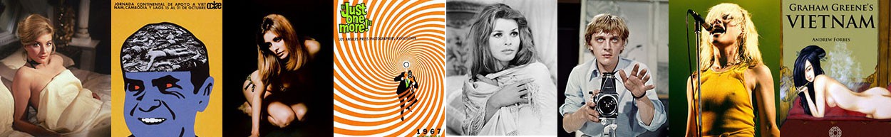
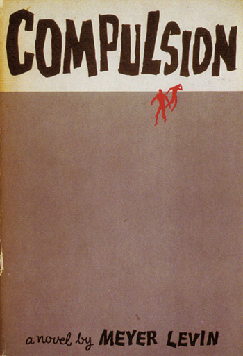
His recent death at the wonderful age of ninety one demands of us a joyful retrospective of an artist who pioneered a very distinctive book cover style known as the ‘big book look’. Responsible for a staggering six and a half thousand book covers and over two hundred album covers his work graced the fronts of many of the great bestselling books of the 1950s and 60s where the use of minimal imagery coupled with bold lettering allowed the book to stand out on the shelves. His designs suggested that the content was so good it required little more than the title, it was bold and ballsy but the books sold in their millions and Bacon cemented his place in the history of twentieth century literature.
Book illustrators seldom receive the credit their work often warrants but the simplicity of Bacon’s covers and those of similar artists such as Paul Hogarth capture a period in time, the essence of the novel and thus the skill of the artist. Consider Bacon’s clients for a moment; Joseph Heller’s Catch-22, Kurt Vonnegut’s Slaughterhouse-Five, One Flew Over the Cuckoo’s Nest, the original hardback cover for Jaws, Phillip Roth’s Portnoy’s Complaint and you understand his prowess.
Any given project usually lasted three weeks, the first two would be spent reading the text and outlining a sketch before finalizing the end product on the final third week. He avoided working alongside the author for fear of them trying to influence his work and the novels are better for it. The final version of Catch-22 would prove to be the eleventh draft Bacon presented to the publisher. That was Bacon, the man. He strove to get the commission right regardless of how many times he was asked to revise it. He once recounted his approach to his work; “I always tell myself: You’re not the star of the show. The author took three and a half years to write the goddamn thing and the publisher is spending a fortune on it, so just back off”
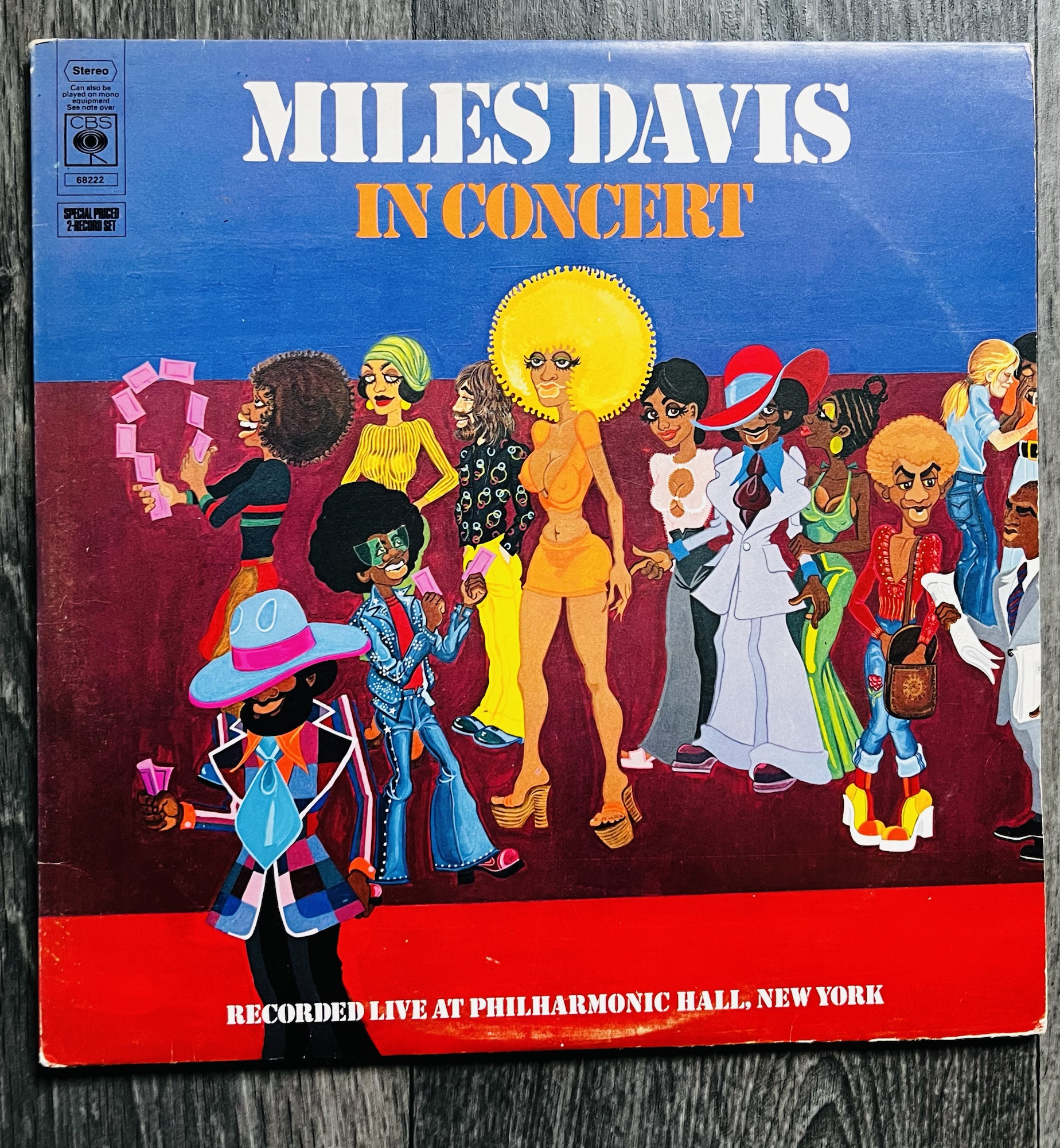
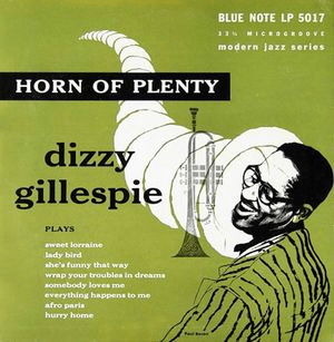
Bacon’s great love was jazz and he recalled his introduction to the music when hearing Benny Goodman for the first time in 1935. He embraced jazz both musically and as an art form, combining his skill at playing the musical comb along with producing album cover artwork for some of the leading jazz exponents of the time.
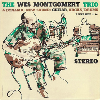 He worked on many projects for the legendary Blue Note label, designing covers for Thelonius Monk, Wes Montgomery, Dizzy Gillespie and Chet Baker. His style was simple but captivating, he embodied the spirit of jazz and its musicians and that understanding flowed effortlessly into his work. By the turn of the eighties he began a one night a week gig with his band at a New York Cajun-style restaurant which he maintained for twenty two years playing a suitably remarkable instrument. He used a tortoiseshell comb which he covered with the plastic wrapping from a cigarette packet and blew through it to recreate the sound of a kazoo and this amazing device could be heard on tours of America, Japan, Australia and a number of cruise ships.
His career spanned over fifty years and despite retiring in 2000, he still took on the occasional freelance project up to as late as 2013. In recent months he was living in a nursing home suffering from Alzheimer’s Disease. It would be nice to imagine a time when artists receive at least a mention in the teachings of modern literature, a classic book should be viewed in the round, yes, the story is the principle factor, of course it is but a cover can go a long way in ensuring the book rather than the story attains iconic status.
Paul Bacon, Illustrator and Musician 1923-2015
Categories: Retro Heaven

