

The artwork of Paul Hogarth for Graham Greene…
 Paul Hogarth (1917-2001) was the artist behind the Penguin paperback editions of the Graham Greene novels. Hiring Hogarth was a stroke of genius in so much as finally making Greene’s books look as good as they read. I can think of few authors from Greene’s era whose first edition books are as visually boring as his. Perhaps his fame was enough to sell the books, that was probably the publishers argument but we must all give thanks to Penguin for righting a wrong.
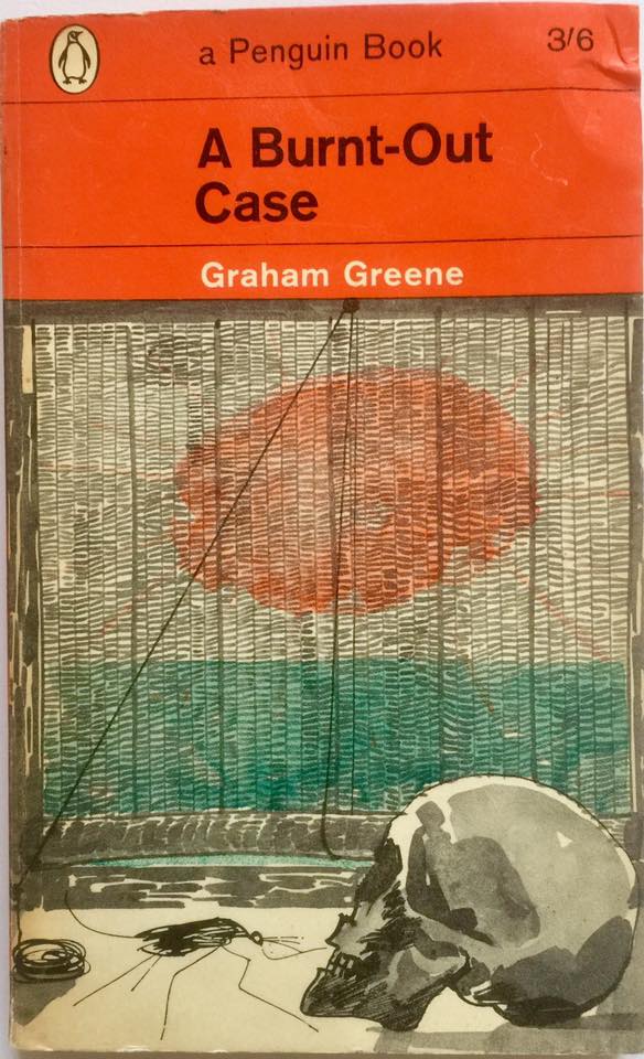
In an earlier post I outlined Paul Hogarth’s career, he led a colourful life and his extensive travels must surely have influenced his artwork and most especially for Greene. The original orange edition Penguin paperback covers are my favourites and in my opinion, his best. His brilliance was his ability to absolutely capture the spirit of the book in one drawing. They were direct in their approach, capturing Greene’s landscape and portrayal of his characters. In A Burnt Out Case (Penguin 1963) the story is set in a leper colony in the Belgian Congo, Hogarth’s depiction of a skull in front of a flimsy window blind and a blazing sun gives fair warning for the story ahead. We know we are in for a typically Greene-style depiction of colonial life in far-flung places: “The air in the hospital lay heavily and sweetly upon them: it was never moved by a fan or a breeze. Querry was conscious of the squalor of the bedding–cleanliness was not important to the leper, only to the healthy” You get the idea.
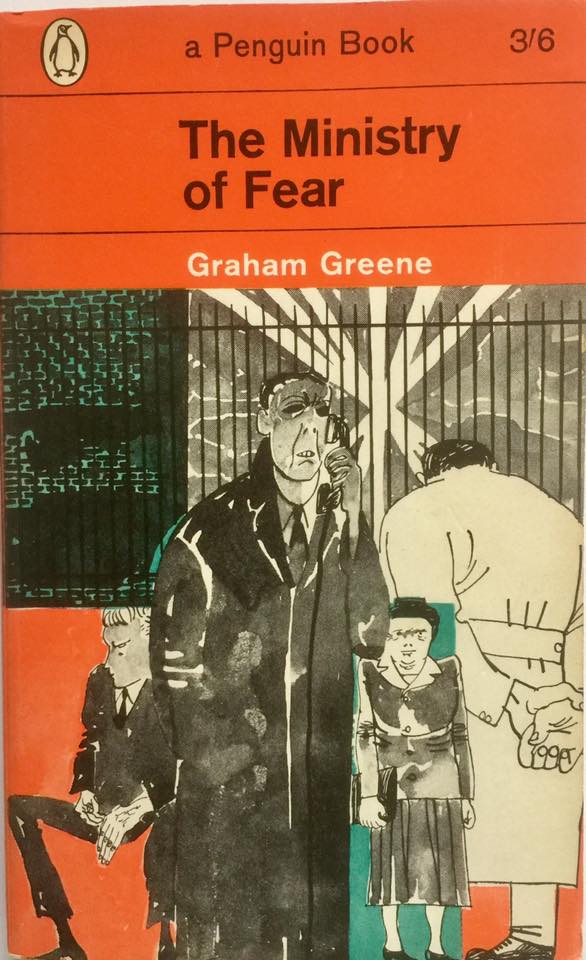 In The Ministry of Fear (Penguin 1963) Hogarth concentrates on the characters rather than the setting of war-torn London in 1943 (the year it was first published) I loved this book, his characterisation of Arthur Rowe as the story’s chief protagonist is sublime, Rowe is numb with the guilt of killing his wife in an act of mercy and Greene takes on those feelings of guilt, loyalty, memory and survival during the Blitz. Hogarth’s characters give a sense of the haunting nature of the book, dark, unseemly and menacing, visually they seem somehow dated today; stern, unforgiving types, their very being shaped by the bombings on their city. If you haven’t read this book then perhaps this might tempt you: “All the way upstairs to his room, he could smell her. He could have gone into any chemist’s shop and picked out her powder, and he could have told in the dark the texture of her skin. The experience was as new to him as adolescent love: he had the blind passionate innocence of a boy: like a boy he was driven relentlessly towards inevitable suffering, loss and despair, and called it happiness.”
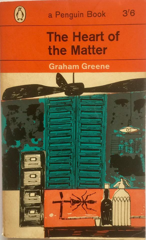 My final choice for this post (more to follow) is another classic in both book content and cover. The Heart of the Matter (Penguin 1962) is set in the then British colony of Sierra Leone during the second world war. Greene’s depiction of colonial life is complete; the heat, the squalor, racial tension and drink-fuelled affairs, it’s all there. In Hogarth’s cover we find the essential elements of military intelligence in its most basic; ceiling fan, bottle of spirits, soda syphon, filing cabinet and closed window shutters to block out the bright sun. I have previously reviewed the film version from 1953, a decent effort if one hasn’t read the book, critically falling short in key areas if you have.
“Down the passage the girl came carrying a vinegar bottle filled with palm wine, and with a sigh of reluctance Wilson surrendered. The heat between the walls of rain, the musty smell of his companion, the dim and wayward light of the kerosene lamp reminded him of a vault newly opened for another body to be let down upon its floor. A grievance stirred in him, a hatred of those who had brought him here. In their presence he felt as though his dead veins would bleed again” One can only imagine the sense of artistic stimulation Hogarth must have felt as he read that. Once again the style of the cover is ‘rough’, it seems to me his skill was in his simplicity, the drawings are unpolished but remarkably effective. The reader must have known what they were in for when they saw this in the bookshop, it is a stunning combination in one book.
I shall feature more of the Penguin/Hogarth covers in the coming months, there are the white cover variants to the classic Penguin orange originals, these are less elaborate but hard hitting nonetheless.
For further information on Paul Hogarth including his bibliography and links to reviews of many of his books please click here
For more information and a bibliography of Graham Greene please click here
Categories: Graham Greene, Paul Hogarth, The Reading Room


A very good cover illustrator when teamed up with the right author, as was the case with Graham Greene. Absolutely disastrous when given a writer he clearly had no sympathy with. I am thinking of the Penguin covers he did for some of Barbara Pym’s novels. ‘Excellent Women’ and ‘A Glass of Blessings’ are two that spring to mind, and they are terrible – washed-out and insipid, presumably what he thought of the books, which is unfair and wrong. It must have lost her a lot of potential readers.
LikeLike